
Design Elegant Websites with these CSS frameworks

So you have had enough of Bootstrap already and you want to try something new and cool. In this era of front-end tools, there are a number of powerful CSS frameworks that can make development a breeze apart from popular frameworks like Bootstrap, Foundation, Material etc. Today I am writing about CSS and Front-end frameworks that are alternative to the popular ones and are easy to use with lots of great features including size and performance.
Bulma

You only need 1 CSS file to use Bulma. Yes, that's it. Simply a collection of CSS classes and the final result is only a single .css file.
There are several ways to get started with Bulma. You can either:
- use npm to install the Bulma package
- use the cdnjs CDN to link to the Bulma stylesheet
- use the GitHub repository to get the latest development version
1. Use NPM:
npm install bulma2. Use the cdnjs CDN
3. Download from the repository
https://github.com/jgthms/bulma/tree/master/css
Sample Code for an interactive dropdown menu using Bulma
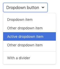
<div class="dropdown is-active">
  <div class="dropdown-trigger">
    <button class="button" aria-haspopup="true" aria-controls="dropdown-menu">
      <span>Dropdown button</span>
      <span class="icon is-small">
        <i class="fas fa-angle-down" aria-hidden="true"></i>
      </span>
    </button>
  </div>
  <div class="dropdown-menu" id="dropdown-menu" role="menu">
    <div class="dropdown-content">
      <a href="#" class="dropdown-item">
        Dropdown item
      </a>
      <a class="dropdown-item">
        Other dropdown item
      </a>
      <a href="#" class="dropdown-item is-active">
        Active dropdown item
      </a>
      <a href="#" class="dropdown-item">
        Other dropdown item
      </a>
      <hr class="dropdown-divider">
      <a href="#" class="dropdown-item">
        With a divider
      </a>
    </div>
  </div>
</div>
Link to Bulma Homepage: https://bulma.io/
Link to Bulma Documentation: https://bulma.io/documentation/
Concise CSS
The main difference between Concise CSS framework and other frameworks like Bootstrap and Foundation is that it includes only the minimum styles that is required to stylize your website. Meaning, styles for only native HTML elements are included in the core. Other components and utilities are optional add-ons as Concise UI and Concise Utils.
There are 3 different ways to install and use Concise CSS for your website.
Using the CDN
This is the easiest way to get started. This can be used if you just want to try Concise CSS.
<!-- Normal - Latest version -->
<link rel="stylesheet" href="https://cdn.concisecss.com/concise.css">

<!-- Minified - Latest version -->
<link rel="stylesheet" href="https://cdn.concisecss.com/concise.min.css">
That is for the latest version, if you want to use a specific one you can add something like the following:
<!-- Normal - Specific version -->
<link rel="stylesheet" href="https://cdn.concisecss.com/v4.1/concise.css">

<!-- Minified - Specific version -->
<link rel="stylesheet" href="https://cdn.concisecss.com/v4.1/concise.min.css">
Install with npm
Execute the following command to install Concise CSS from NPM. If you are new to NPM, you can check their documentation first.
npm install concise.css
Then you can include the main file inside your project:
//
// main.scss
// ---------

// Concise Core
@import "node_modules/concise.css/concise";
Sample comparison code of a conventional grid system and a grid using Concise CSS
<!-- Common approach -->
<div class="grid">
  <div class="col-6 pull-col-4">…</div>
</div>

<!-- Concise CSS -->
<div grid>
  <div column="6 +4">…</div>
</div>
Link to Concise CSS Homepage: https://concisecss.com
Link to Concise CSS Documentation: https://concisecss.com/documentation/
Semantic UI
This framework and it's philosohy is quiet interesting. It's true that it helps create human-friendly HTML, and according to it's website as mentioned
Semantic UI treats words and classes as exchangeable concepts. Classes use syntax from natural languages like noun/modifier relationships, word order, and plurality to link concepts intuitively.
Just take a look at a very simple code below.
<div class="ui buttons">
 <button class="ui button">One</button>
 <button class="ui button">Two</button>
 <button class="ui button">Three</button>
</div>
Install NodeJS
To set up NodeJS you can follow the steps below, or check out the download page on nodejs.org
Option 1: Homebrew
After installing homebrew
brew install nodeOption 2: Git
git clone git://github.com/nodejs/node.git
cd node
./configure
make
sudo make install
Install Gulp
Semantic UI uses Gulp to provide command line tools for building themed versions of the library with just the components you need.
Gulp is an NPM module and must be installed globally
npm install -g gulpTo Install Semantic UI
Semantic UI is available in an eponymous package on NPM
npm install semantic-ui --save
cd semantic/
gulp build
Include in Your HTML
Running the gulp build tools will compile CSS and Javascript for use in your project. Just link to these files in your HTML along with the latest jQuery.
<link rel="stylesheet" type="text/css" href="semantic/dist/semantic.min.css">
<script
  src="https://code.jquery.com/jquery-3.1.1.min.js"
  integrity="sha256-hVVnYaiADRTO2PzUGmuLJr8BLUSjGIZsDYGmIJLv2b8="
  crossorigin="anonymous"></script>
<script src="semantic/dist/semantic.min.js"></script>
Below is a video tutorial to get started with Semantic UI framework
Link to Semantic UI Homepage: https://semantic-ui.com/
Click here to go to Semantic UI Documentation
Skeleton
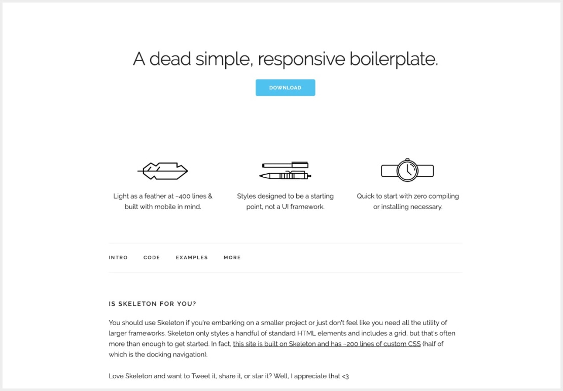
As the name says. Simple. Dead simple. A boilerplate that you want for your small projects and you want to avoid all the extra CSS and utilities provided by larger frameworks. And it's so simple that this framework needs no more explanations.
Download the Skeleton files from the GitHub Repository link below:
https://github.com/dhg/Skeleton/releases/download/2.0.4/Skeleton-2.0.4.zip
Sample Buttons and the code
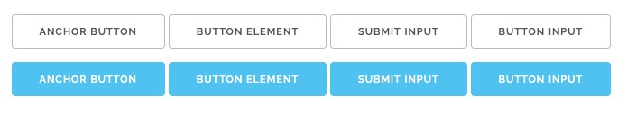
<!-- Standard buttons -->
<a class="button" href="#">Anchor button</a>
<button>Button element</button>
<input type="submit" value="submit input">
<input type="button" value="button input">

<!-- Primary buttons -->
<a class="button button-primary" href="#">Anchor button</a>
<button class="button-primary">Button element</button>
<input class="button-primary" type="submit" value="submit input">
<input class="button-primary" type="button" value="button input">
Link to Skeleton Homepage: http://getskeleton.com/
Link to Skeleton Documentation: http://getskeleton.com/#intro
UIkit

Uikit is another lightweight and modular front-end framework which you can use to write well-structured, extendable code which is easy to maintain. The components have conflict-free naming conventions and very easy to customize.
Setup and structure of UIkit
You can download UIkit and all the source files from the GitHub repository below.
File Structure
In order to keep it slim, the framework of UIkit has almost no styling . Two additional distributions with a gradient and an almost flat style is also provided.
| Folder | Description |
|---|---|
/css |
Contains all UIkit CSS files and minified versions. |
/fonts |
Contains fonts used in UIkit. |
/js |
Contains all UIkit JavaScript files and minified versions. |
/css
    <!-- UIkit with the basic style -->
    uikit.css
    uikit.min.css

    <!-- UIkit with Gradient style -->
    uikit.gradient.css
    uikit.gradient.min.css

    <!-- UIkit with Almost flat style -->
    uikit.almost-flat.css
    uikit.almost-flat.min.css

    <!-- Advanced components -->
    /components

/fonts
    <!-- FontAwesome webfont -->
    fontawesome-webfont.ttf
    fontawesome-webfont.woff
    fontawesome-webfont.woff2
    FontAwesome.otf

/js
    <!-- JavaScript and minified version -->
    uikit.js
    uikit.min.js

    <!-- Advanced components -->
    /components

    <!-- Core components -->
    /core
HTML Page Markup
You need to add the compiled and preferably minified UIkit CSS, JavaScript and JQuery to the header of your HTML5 document.
<!DOCTYPE html>
<html>
    <head>
        <title></title>
        <link rel="stylesheet" href="uikit.min.css" />
        <script src="jquery.js"></script>
        <script src="uikit.min.js"></script>
    </head>
    <body>
    </body>
</html>
UIkit on cdnjs.com
UIkit is hosted on the Cloudflare CDN via cdnjs.com.
<link rel="stylesheet" href="https://cdnjs.cloudflare.com/ajax/libs/uikit/2.xx.x/css/uikit.min.css" />
<script src="https://cdnjs.cloudflare.com/ajax/libs/uikit/2.xx.x/js/uikit.min.js"></script>
Example Slider sample code
To apply the Slider component, add the data-uk-slider attribute to a container element around a .uk-slider-containerelement.
Markup
<div data-uk-slider>

    <div class="uk-slider-container">
        <ul class="uk-slider uk-grid-width-medium-1-4">
            <li>...</li>
            ...
        </ul>
    </div>

</div>
Link to UIkit Homepage: https://getuikit.com/v2/index.html
Click here to go to UIkit Documentation
Comments